Black backgrounds and black objects
There is a certain type of drawing technique in comics, that makes me grind my teeth whenever I see it. It's when an artist fills in the background with black, but they don't take the ink right to the edge of the linework. Instead, they leave this white glowing edge. IN some ways it feels like a stylistic choice, but I find it jarring. I think it's jarring partly because it feels like the artist didn't want to take away from their line art, it feels like they're being a little too precious.
Now I hate to do this kind of art critique, as I feel people can draw how they want. But this particular situation irks me as I can see what they are trying to do and how they have failed at it. I am not saying I am perfect, I have probably made this mistake myself numerous times.
Fellow comic artist David Blumenstein wrote about using the ‘beggars hand’ a few years back and as much as it pained me to read, ie, Knowing that I was guilty of this indulgence, but it made me think twice before drawing it. I am hoping the post can help out in a similar way.
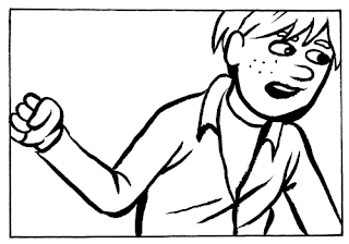
I have drawn a simple and crappy comic frame to try and demonstrate what I mean.
This is the original drawing, a bit plain and I want to add some black to make it pop
Option A: First the wrong way to do it...
Now let's add some black here...but wait, I've got a little too precious about my own line work so I haven't taken the black all the way to the line. It looks like the figure has been cut out and stuck on.
Option B: Second wrong way to do it...
Now let's colour in his jacket black. Again I have not taken it to the edge of the line, what am I doing, this isn't working...
Option C: A better way to do it...
Here is a better way to do it if the background and top are both black. I only need that one white line. The line should probably even extend a little bit where there is some overlap in the figure.
Option D: Another better way...
Here you can see I have taken the black all the way to the line, I think this works much better. It is not distracting like Option A. The reader's eye can more easily process the image and move on. Which is what you want with comics.
Option E: Even another way...
I have quickly done an inverse in photoshop, it is a bit of a rush job, but it demonstrates the effect. Still a little weird and glowly but it could work in the right circumstances. Much better than options A and B, and is perhaps a more extreme version of C.
Now there are many ways to get contrast when spotting blacks like this, these are only a few examples. Feel free to disagree in the comments or add your thoughts.
I particularly enjoy looking at illustrations like these,
Which make interesting use of a simple select and inverse option in Photoshop to great effect.


Comments
Post a Comment