
Working on my lettering
When I started my Bored in Space comic, I was going for a different look than my usual sketchbook style I had for my autobio comics.
For one thing I was aiming this comic at more discerning younger readers. Anywhere from 12-16 primarily but also in a way that could be enjoyed by all ages.
It's funny because making this decision, I believe, has greatly improved my understanding of lettering and lettering skills overall. Now I'm not sure why I didn't do this earlier, I look back on some older comics and the lettering was really not at the top of my concerns, but it should have been.
What did I do to improve?
- Studied other comics intensely. I think this is not done enough. Perhaps because of fears around copying or picking up bad habits. But study the masters of your field, break down what they do to truly understand what they are doing. There is often a science behind the art. I actually measured the lettering with a ruler of various comics, looked at leading sizes. I even imported comic pages and traced over them to get a better sense of scale etc.
- Created digital lettering guides. This was always tricky when working with paper. You can use an Ammes lettering guides but it's a lot of extra work. I had to go through many drafts of a digital guide, but after around 10-12 attempts I came up with some good ones.
- Created/tweaked inking brushes to be better lettering brushes.
- Read as much as I could online about lettering tips and techniques and tried to implement what I learned.
- Assessed my letter forms. Looked at how certain letters where written and added more traditional styles.
- Looked at standards in most mainstream comics. I learned two things by doing this. 1-how to properly emphasise text, IE, Bold + Italic. 2- that I should end all lettering with a period, a convention I had always ignored/was ignorant about.
- Traced over digital fonts. I had read about this technique previously as a way to get clean consistent lettering. It involves using a digital font for your draft lettering and hand ink over the top. That way you get the uniform lettering with that hand written feel.
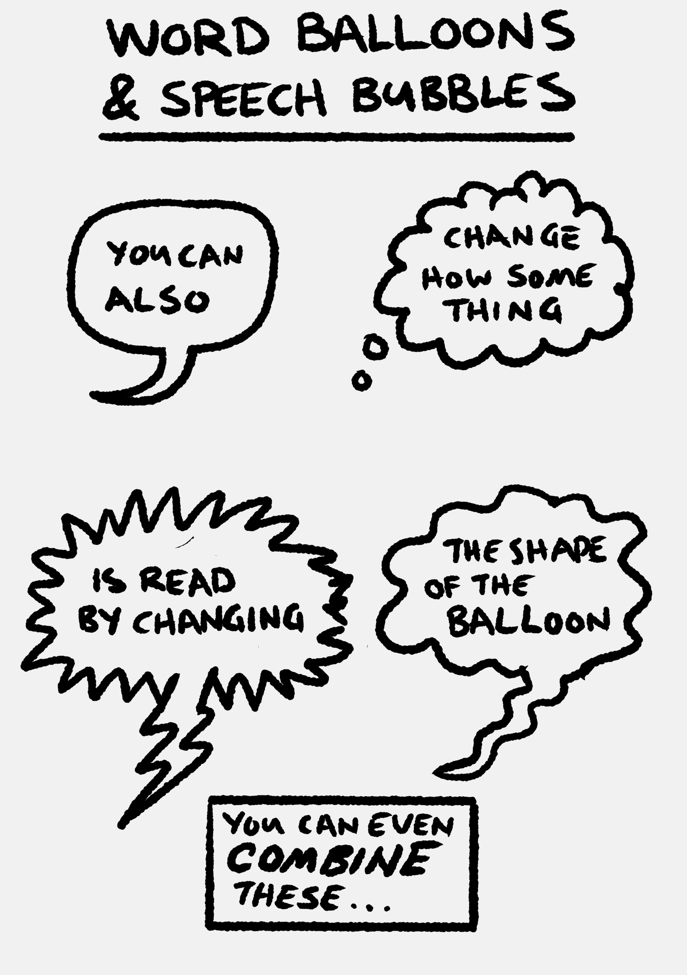
- Started making better speech balloons. I had previously just drawn around the lettering however it appeared. I was now laying out my lettering in a more uniform and pleasing way and creating speech balloons that were more consistent.
- Two recent tips. 1-In general the tails should mostly point from the centre of the balloon to the speakers mouth. 2-Try and break up speech balloons to match the cadence of speech, I.E., consider using another balloon rather than a comma.
I still have improvements to make. As always improving in art is making thousands of tiny steps that eventually add up to small gains over time. It's like collecting tears to fill up a giant bucket.
Here are some instructional drawings I have been working on to help beginners learn more about lettering.


Comments
Post a Comment